How IMOs and BGAs Use Dashboard Data to Evaluate the Health of Their Downlines

Ara Leiva
May 28, 2026
Want to help more clients?
TALK TO SALESDownlines are some of the most important relationships in an IMO or BGA's distribution network — and they're also some of the most underreported. Most upline organizations review downline performance through quarterly statements and occasional conversations rather than ongoing production visibility. A dashboard built on downline production data changes that. This post covers what to measure and how to act on it.
Most IMOs and BGAs have a tiered distribution model. They don't work only with individual agents — they also have downlines, smaller distribution organizations that sit between them and the agents in the field.
Those relationships are often some of the most significant production sources in the network. They're also some of the least monitored in real time. An individual agent's production change is visible in daily case and commission data. A downline's production pattern — which may involve hundreds of individual agents — is harder to synthesize without a dashboard that aggregates that data automatically.
The result is that IMOs and BGAs often have an impressionistic view of their downline health rather than a data-driven one. They know which sub-agencies feel strong and which ones seem to be struggling. They don't necessarily know, in specific terms, how production volume, placed rates and carrier mix are trending across each relationship — or what those trends mean for the future.
What Does Downline Relationship Health Look Like in Data?
Downline relationship health in production data shows up across four dimensions.
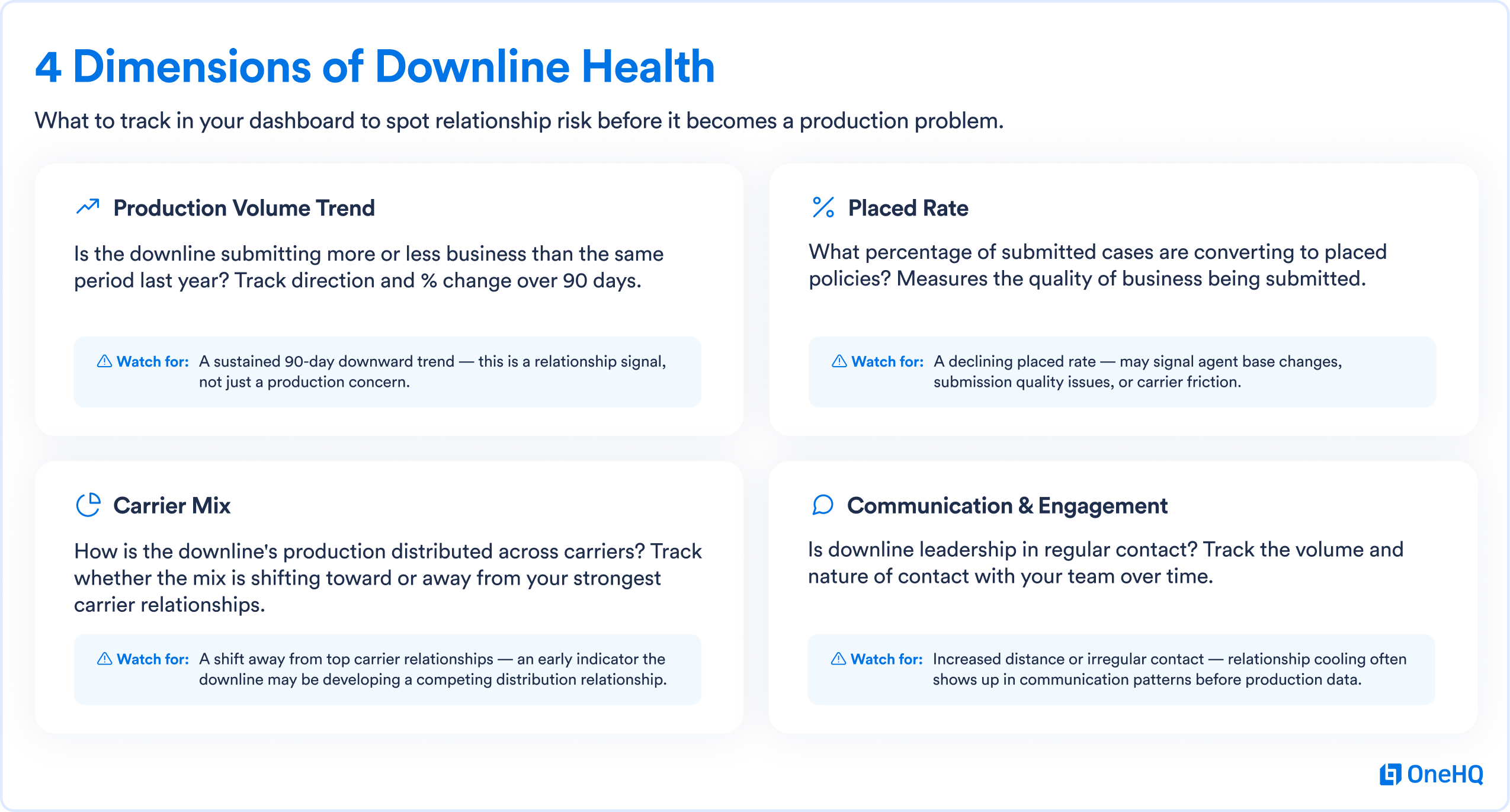
Production volume trend: is the downline submitting more or less business than the same period last year, and is that trend improving, flat or declining over the last 90 days? A sustained downward trend is a relationship signal worth acting on, not just a production concern.
Placed rate: what percentage of the downline's submitted cases are actually converting to placed policies? A declining placed rate can indicate problems with the quality of business being submitted, changes in the sub-agency's agent base or issues with the carriers they're working with.
Carrier mix: is the downline's carrier distribution changing? A shift away from your strongest carrier relationships toward carriers where you have less volume credit is worth understanding.
Communication and engagement: is the downline leadership in regular contact with your team? Is the volume and nature of that contact consistent with a healthy relationship or showing signs of distance?
Your data visualization module connected to your Distribution Management System and Incentives & Commissions Management platform can help surface these four dimensions for each downline in your network automatically — giving you a health view that updates in real time rather than requiring a manual quarterly review.
These insights are most valuable when the underlying data is clean, consistent, and properly structured. Accurate producer records, well-maintained hierarchy relationships, normalized data, and up-to-date case or commission information are essential for giving IMOs and BGAs a reliable view of downline health.
Why Downline Health Is Hard to Monitor Without a Dashboard
The challenge with monitoring downline health is that downlines aggregate the production of multiple individual agents. A single downline might have 50 to 500 individual producers contributing to the production volume that flows up through your hierarchy.
Evaluating that aggregate picture — understanding whether a production decline is coming from a specific agent cluster or from a broader pattern across the downline — requires pulling data at the individual agent level and organizing it by downline. On a disconnected reporting environment, that's a significant manual effort that most upline organizations don't undertake regularly.
Dan Eibner of National Brokerage Agencies, which supports approximately 80 independent BGAs, described the complexity of managing that kind of distributed network: "We wanted someone who truly understands the business — because you can go out and get an accountant and they can build something, but they don't understand your business." Data visibility at the downline level requires both the right platform and the right reporting structure — one that's built for insurance distribution hierarchies rather than generic organizational structures.
Building a Downline Health Dashboard
A downline health dashboard organizes your production data at the downline level rather than the individual agent level, giving you an aggregate view of each relationship without losing the ability to drill into individual agent performance when you need more detail.
The core view shows each downline as a row, with columns for current production volume, 90-day trend (direction and percentage change), placed rate, carrier mix distribution and the date of last meaningful contact with your team. A visual indicator — green, yellow or red based on configurable thresholds — gives your sales leaders an immediate sense of which downline relationships need attention this week versus which ones are performing well and can receive lighter-touch contact.
The drill-down view, available for any downline with a click, shows the individual agent production within that downline — revealing whether a production decline is concentrated in a few agents or distributed across the whole network.
This structure gives your leadership team a portfolio view of downline relationships that's manageable at scale: a quick scan of the dashboard surfaces the relationships that need action, and the drill-down gives you the context to understand what kind of action is appropriate.
What to Do When a Downline Shows Health Warning Signals
When a downline shows production decline, placed rate deterioration or communication distance in your health dashboard, the appropriate response depends on the specific pattern — and production data helps you choose the right intervention.
A production decline concentrated in a few agents within the downline suggests an agent-level issue: the downline may have lost a few key producers, or specific agents may be struggling. The conversation with downline leadership is about those specific agents and what support is available.
A production decline spread broadly across the downline's agent network suggests something systemic: a carrier relationship change, a product line shift, leadership transition within the downline or a regional market condition. The conversation is different — and requires the downline-level data to have credibly.
A shift in carrier mix — away from your strongest carrier relationships — may be the most important early warning signal of a downline that's developing a competing distribution relationship. Catching that shift early, when there's still an opportunity to understand and address the underlying reason, is only possible with real-time carrier mix visibility.
Ideal Producers Group uses OneHQ’s data and reporting to gain this type of production visibility. Karen Essary noted that the platform gives her the ability to see "how much premium has come in from each agent week by week, month by month." That same visibility, aggregated at the downline level, is what a downline health dashboard provides for an upline organization.
Using Downline Health Data to Strengthen Relationships
Downline health monitoring isn't only about catching problems — it's also about recognizing and investing in relationships that are performing well.
When a downline dashboard shows strong production growth, improving placed rates and consistent carrier mix across a 90-day period, that's a signal worth acting on proactively. Recognizing the downline leadership for their performance, exploring opportunities to deepen the relationship or offering additional support resources builds the partnership at its strongest point rather than waiting for a problem to prompt engagement.
The agencies that build the deepest downline relationships are the ones that communicate based on data — both when things are going well and when early warning signals appear. That consistency of engagement, backed by specific production evidence, is what distinguishes a genuine partnership from a transactional distribution arrangement.
Interested in building a downline health dashboard for your network? We would be happy to show you what that looks like. Talk to our team to see how OneHQ's data visualization module handles downline and hierarchy-level reporting.